Lifefilter Twitterfeed

Twitter Updates

    follow me on Twitter

    Wednesday, August 29, 2007

    Vice's Colt 45 Bag + Comic Adventures


    Vice is without a doubt one of the most irreverent and cherished magazines out there today. Vice is that guy that really doesn't give a f$%k. They say what everyone is thinking but is afraid to, traveling to the places you are told to avoid, and other general badass types of things. I had the privilege of chatting with the Vice folks last week, and got hooked up with some schwag including the latest issue of Vice Magazine. While the magazine was the original media vehicle, it now extends to ViceTV, music, and video content. Each platform is true to the brand's (dare i say corporation's) root which is incredulous considering how massive it is. Or is it? Vice has never really wavered in terms of street cred despite going from a freely-distributed zine to a multi-platform self-funded global publishing empire.

    Ok enough of the Vice-hyping jazz. The latest issue has some very cool things if you actually got your hands on it. A paperbag branded with colt 45 allows you to cover your bag in true "brown-bag style" just like all the homies who like to kick it incognito. Smart smart smart. The coolest thing about drinking 40's are the stylish brown bags, and not swilling that malt liquor. The bags could potentially cover everything from sodas to your Corona. All done on the cheap...well done colt, well done. Anyone who reads the mag knows Colt 45 has a relationship with Vice, so maybe its not so much of a surprise; but inside the bag is a colt45 comic book by various artists chronicling the adventures of the brand. Do I smell a scion here? I'm on the fence, when people refer to Pabst as authentic, but Colt 45 has been around the block and i think they realize they do have cache with a different audience than 20 years ago. Is colt 45 the next Pabst?

    CorporateVice

    Read more...

    Ronnybrook's Milkbar


    Pretty much old hat in NYC, but i took this photo months ago when this place first opened. Ronnybrook Farms has opened what could be the first of its kind, Milk Bar in Chelsea Market. Very interesting turn for a brand, but judging by the crowds immensely successful.

    The brand is somewhat revered in NYC, as being from "upstate" (in a positive manner) and "true" farm from its sidewalk sales down in Tompkins Park on the weekends. Chelsea Market is a fantastic collection of food retailers in a relative transparent environment, allowing consumers to watch the production of the goods for sale. Ronnybrook has a wall lined with ancient milk crates, a circular bar in the center with ice cream and they offer diner fare as well for those looking to sit down for a bit. Quite a few people came in just to purchase their milk from the coolers in the wall. Advantage niche store!

    Apparently there is a history of milk bars, but this one seems one-of-a-kind to me. Other brands that live in convenience store aisles or are single-serve should see this as a great example how to create a retail and community connection with consumers. Dairy farmers' ads have been quite popular and well-branded over the years, might milk be one of the most progressive foods we have?
    Moo

    Read more...

    Monday, August 27, 2007

    The Whole Food's Beer Room: MMMMM


    The Whole Foods experimental juggernaut rolls on! Down at the Houston Street location a "beer room" has opened with over 200 international and domestic beers and six local beers on tap. But you can't drink at the bar they have in the store.....You can sell it, but you can't drink it...TRAGIC!! The nice touch is that you can fill up growlers (1/2 gallon) to take home, to minimize environmental impact. Gridskipper keenly notes "It's like they took Trader Joe's idea for the wine shop and turned it into something actually cool and useful." Supposedly beer workshops are the next step. Homebrew anyone?
    WholyBeerBatman!

    Read more...

    Saturday, August 25, 2007

    Reinvention: The Roasting Plant


    Coffee. Been done a thousand ways and once more. Dark, light, mug matching etc. Here's a new take from the Roasting Plant on the LES. Popped in the other day for a peek. They are known fo their coffee that never touches the outside air, beans to roast to consumption. Its allll about the air baby or lack their of it. No humans ever touch the beans and heck they dont taste the sweet air till you drink it. Great spin on branding coffee while everyone else does pods and communal collaboration tables for creative-types. They truly believe they have the most perfect roast; through a controlled and multi-system integrated roasting and brewing system for untouched beverage bliss. The product is questionable, Consumers seem to buy it though juding foot traffic. Modern provenance is an Interesting twist, but is the coffee really better? I wouldn't know, i don't drink the stuff.
    RP

    Read more...

    Thursday, August 23, 2007

    Fresh Brewed Design


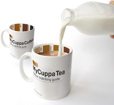
    Suck UK have come up with a visual solution to morning brewing for all you interns. A pantone-style mug, shows all the shades of tea, from Milky to Builders'. There's a coffee version too. Brillant Design!

    viaGizmodo

    Read more...

    Monday, August 20, 2007

    Packard Jennings


    Boingboing has pointed me to this incredibly creative site run by the Centennial Society /Packard Jennings. Their acidic look on life in the states and globally is well-executed in their graphic design and farces in the common spaces of the office, advertising and the mall. They even go so far as to distribute pamphlets of their mockeries in the public space. One of the best is a 16-image that was produced to put inside the postage-paid, business-reply envelopes that come with junk mail offers. Every envelope collected was stuffed with the pamphlet and mailed back to its original company. Yes! Creative ideas such as this have a currency that spreads not only because its funny, but because it creates social situations everyone only dreams about. These guys are disruption at its finest!

    LaughaThon


    Read more...

    Lifefilter Refreshment


    Its been tooooooo long since i have made any type of change. New code, new layout, new(ish) look. Comments will be back up soon enough. Let me know your thoughts if you like it, hate it, mildly appreciate it in a laid-back kinda way...

    refresh

    Read more...

    Thursday, August 16, 2007

    Its All About the Container


    Nalgene has a brilliant little thing going on with their bottles. Great design is multi-functional (behaviorial and occasion -ly speaking here). Consumers sporting these bottles are either your backpacking hippies, socially conscious or just proactive planners. Nalgene has stuffed their bottles with helpful things you need for travel, your pet, kids, the hot hot heat, your auto and first aid for your scrapped knees. Brilliant use of the err technology there guys. Positioning the brand as a 'container' over just a water bottle, makes a stronger case for not only its usage occasion but its stature as a brand. Not to mention you can drink out of it when you get thirsty.


    All in your usual 32oz classic nalgenes… each with a signature color for branding naturally.
    via notcot

    ContainerStore


    Read more...

    Thursday, August 09, 2007

    Children Would Eat McDonalds Tar if they Could


    A new study has come out showing the power of branding works. The bad news is children prefer everything in a McDonalds Wrapper. The JAMAstudy wanted to describe how food marketing that targets children is grossly widespread (hmm thats not leading) and seeks to highlight the more than 10 billion dollars spent per year to market to children. What i found extraordinary was that "by the time they are two years old children may already have beliefs about certain brands, and by the age of 6 they can recognize brands and say which products they belong to."

    A few of the eye-popping results:

    * On average, the children preferred the taste of the food and drink in the McDonald's packaging over the identical products in unmarked packaging.
    * The result for hamburgers was 48.3 per cent vs. 36.7 per cent.
    * For chicken nuggets the result was 59 per cent vs. 18 per cent.
    * For baby carrots the result was 54.1 per cent vs. 23 per cent.
    * For french fries the result was 76.7 per cent vs. 13.3 per cent.
    * For milk or apple juice the result was 61.3 per cent vs. 21 per cent.
    * Futher analysis showed that 4 out of 5 times, children preferred the taste of food and drink that they thought was from McDonald's.
    * Preschool children who had more TV sets in their homes, and children who ate McDonald's foods more frequently were also more likely to prefer McDonald's branded food and drink to the identical unbranded items.


    It's nothing new that children are sponges to our everyday behaviors. What is interesting is the wide-margin between desirable and non. Organizers plan to contrast different brands and packaging with variable levels of recognition and natural exposure. I wish i had a chance to ask a few more questions:


    *Imagery
    Types of colors/logos/characters that appeal to tots. What is the range and relation?

    *Occasion
    When are these children connecting with the products and where? Is it beyond the TV? Could it?

    *Food Type
    How much does natural play in here? These foods are just Big Macs, but products outside the current offerings. How far can this stretch?

    *Behavior vs Awareness
    This is the biggie for me. So these children prefer it, but do they act on it (or mom)?

    *Brand Depth
    While i would deep dive on all the above areas, looking at the role of other brands would be particularly interesting.
    How far does the power of branding reach? How much do lesser brands play a role and whats the relation to advertising (probably immense, but its that million dollar question)

    *Influences
    What kinds of things populate their life and to what extent?


    Not one mention of Ronald either. Poor Chap. McDonalds should wake up from their cheesburger coma and realize they have a nice insight here. Definitely something to incorporate into an established brand that is apparently shaping values in products they could be offering.

    McFat


    Read more...

    Tuesday, August 07, 2007

    Driving Reality: Driving Miss Daisy


    I absolutely love this concept!! A driving service for senior citizens in Canada is called "Driving Miss Daisy". Having several members of my family who don't drive anymore, something like this is going to be highly desirable for boomers as they age. The service takes consumers to medical appointments, shopping, the airport and more. They will accompany you to social events or on your vacation. What really gets me is the playing on popular culture. Though there are some naming issues, i wish more brands would incorporate social and cultural resonate items into their ideas. Great differentiator for a driving service.

    FriedGreenTomatos


    Digg!

    Read more...

    Planning Resource: MisEntropy


    With the AAAA's Planning Conference going on and me continuing my boycott of the event for shitty venues I thought i would be generous and post a planning resource. Its in San Diego? Oh snap, nevermind but here is a great resource anyway. I'm sure im missing the occasional good talk with lots of old friends, but we do have one brave soul out there who shall remain unnamed.

    MisEntropy is a great resource for planners looking to waste time err explore. Pretty much every planning blog type and personality is represented on here, and if you aren't, kindly email and you can be there too.
    PlanningSearchEngine


    Read more...

    One Loves: Digital Gravel


    There are so many sportstyle websites out there from hypebeast to hypediss to to riott (shout out to Trane) to sneakerfreaker Each covers that seem street scene/ street style world i have unfortunately become accustomed to being a part of. For some reason though i really love Digital Gravel. I would have been clueless had i not done some work for a shoe and sportwear giant with some kids who were really the beta bunch. Digital Gravel sends out daily emails of the latest joints and links where to pick them up. Part of me believes that as economies switch to digital, filters will really rise in importance. While consumers are more empowered and want control, the majority still like things curated and handed to them. Its the filter that makes things interesting. Digital Gravel is a great lens on streetwear, in the way thrillist and dailycandy have established themselves. Minus the witty text, DG is pure up eye candy. Take a gander if you need a style check.

    GoBarefoot


    Digg!

    Read more...

    Monday, August 06, 2007

    Best Buy Phasing Out Music?


    Just an observation; but was down at the Best Buy on Broadway in Noho this weekend and low and behold the entire music department was gone. Entirely! Unless its been regulated to a small room in the back, all CDs have been replaced by a best buy mobile department and digital cameras. Sign of our (digital) times indeed...
    YouBestBuy

    Digg!

    Read more...

    delicious

    Feeds

    Powered by Blogger

    Listed on BlogShares

    CURRENT MOON

    Legalities

    Creative Commons License
    The written words are solely the opinion of the author and in no way, shape or oblique form direct representation of the author's employer, clients and associated corporations.

    Filterheads

      © Blogger templates The Professional Template by Ourblogtemplates.com 2008

    Back to TOP